

Magazine: ATTITUDE
Attitude is a magazine created by multiple graphic designers. The concept and inspiration was based on a grungy vibe representing women’s attitude in a confident manner and overall just embodying themselves. As well as, showing our honest view of Montreal and its shenanigans. A lot of the inspiration comes from punk and grunge movement, allowing women to rebel against all the gendered expectations and rules. Our magazine is for young adults with a creative and unconventional side. And for the people who are on a tight budget.
–
The Design and Process of “ATTIDUDE.”
For this project, our Publication and Design teacher had given us the task to write two articles, create 2 advertisements and while having 5 minimum original images. Before we could get to designing, we all had to come to a vote on which fonts and a possible color palette. We agreed that choosing a bold font is the way to go since we’re going for a strong and fierce magazine such as Anton and Anvers. And as for the colors: black, red, pink and grey. We made a moodboard showcasing what vibe we wanted and different and fun ways to elevate our work.
–
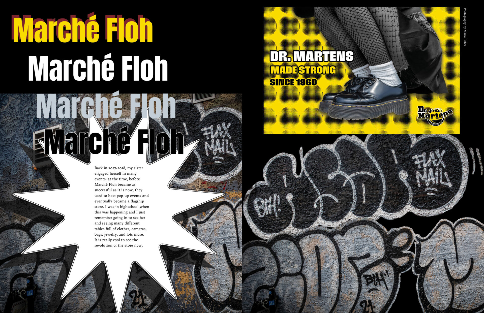
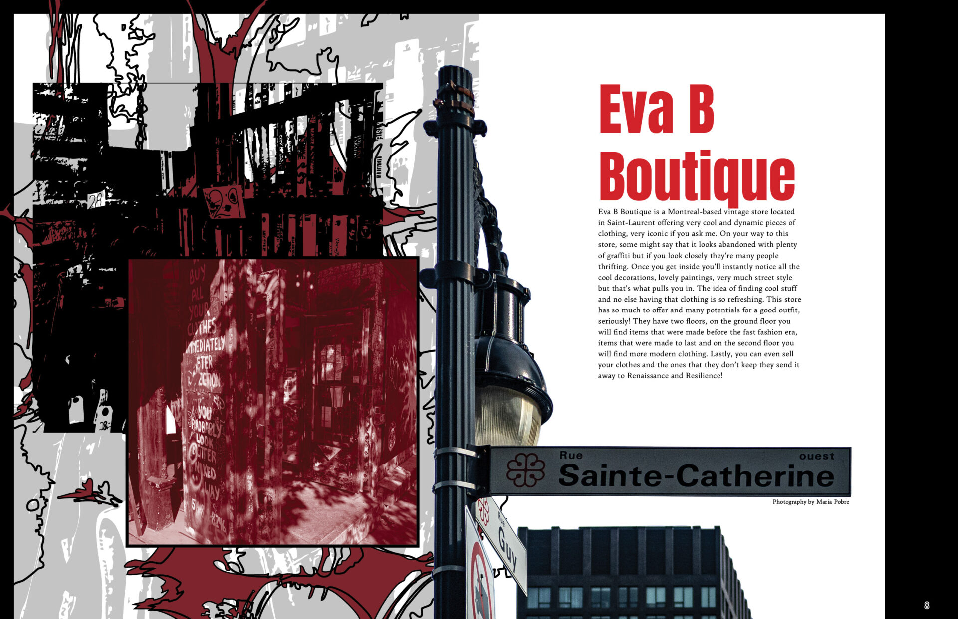
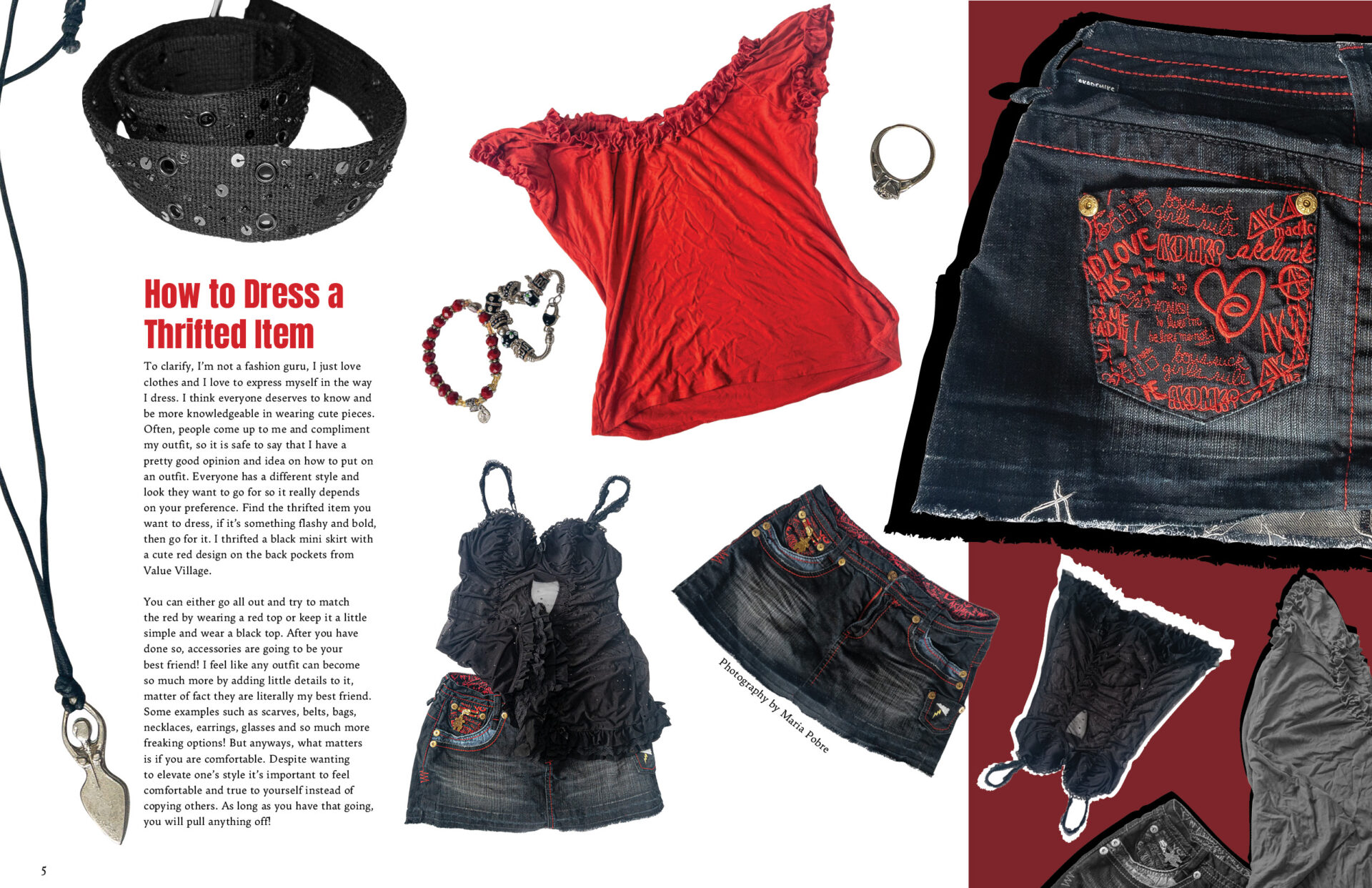
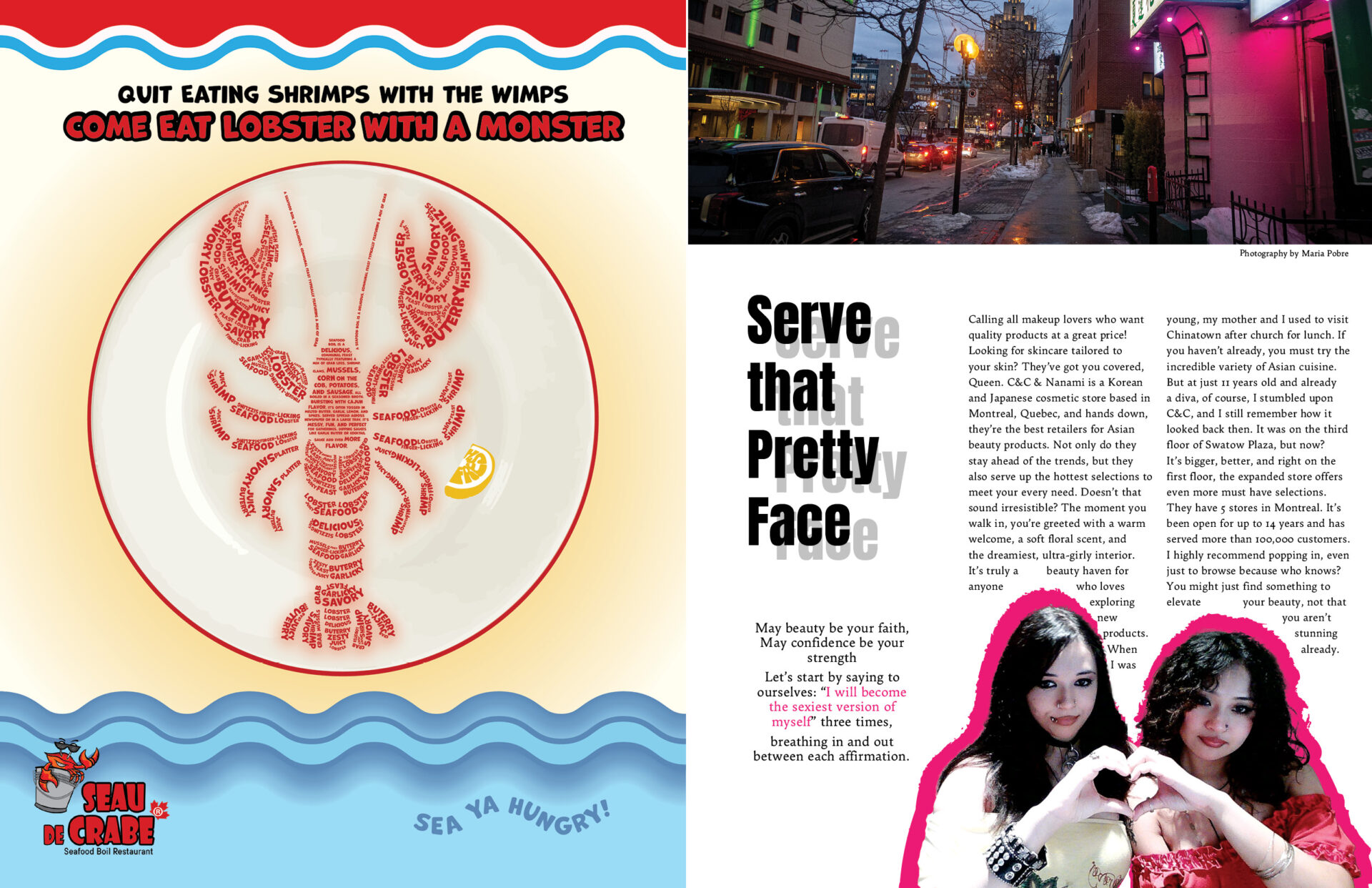
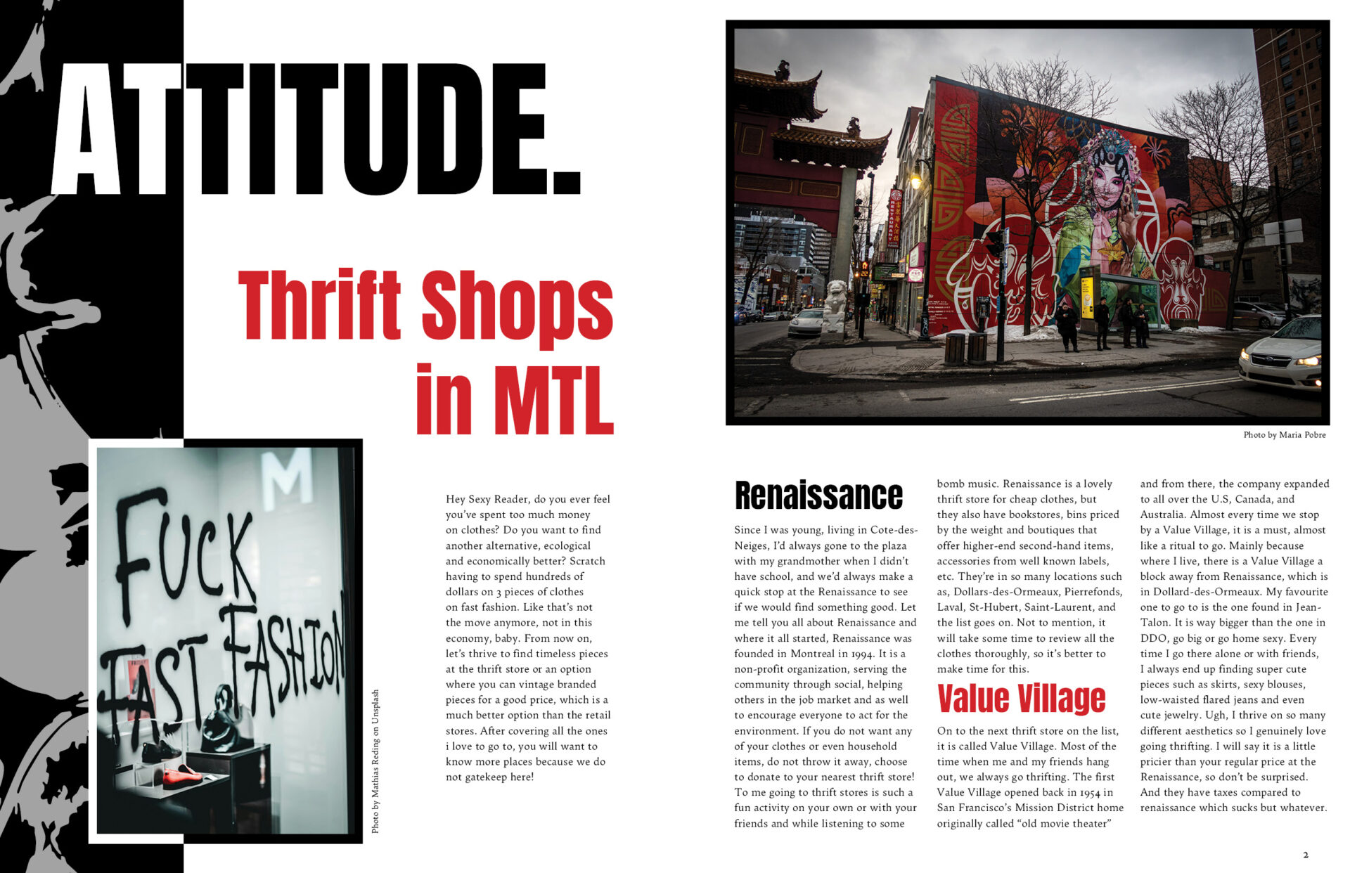
For my part of the magazine I wanted to talk about a fun and inexpensive way to hangout with friends and purchase good thrifts. I showcased many different thrift stores and even decided to create an article on how to dress a thrifted item. For my first page, I wanted to start it off strong and bold using black, red and white. Including an image stating “FUCK FAST FASHION” to give off that uncensored, fierceness. Every little detail including the mix-match of the black and white, and illustration from the left side to create that unrestricted and punk like energy. On my next spread, I wanted to spread some good knowledge on korean makeup stores and wanted to spread good energy for all the beautiful people by simply incorporating an affirmation, ““Let’s start by saying to ourselves: “I will become the sexiest version of myself” three times, breathing in and out between each affirmation.”” I added an image I took of china town which matches perfectly for the vibe I was going for. Pink for love, and pink because the Korean/Japanese store, their interior is definitely more on the pink side. I also added an image of myself and my friend signing a heart with a pink outline. On the next spread, my favourite aspect of it was having to take pictures of my clothes photoshopping, cutting out the background and just the item itself. The clothes itself really gave off the boldness despite the white background.